Introduction
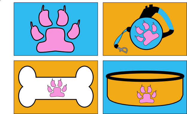
These are some icons I designed with the intention of making them consistent and appear as though they belong together. Using principles of design, I attempted to make them appealing to the audience. They will be available in this post with different sizes of each one to analyze. The icons needed resized to fit into the different requirements for this project.

![]()
Intended Audience
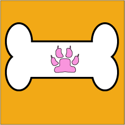
I could see these icons being used on a website selling pet supplies. These would clearly resonate well with pet lovers and people with pets. Each Icon could represent a different category of pet supplies that someone could click on to go shopping. One icon would lead to leashes and harnesses. Another would be a link for buying a pet by clicking on the paw print. The bone would lead to buying dog treats or toys. With the dog bowl, it could lead to all sorts of dog food brands or just shopping for dog bowls.


Design Analysis:
Color Scheme
From the previous pictures posted above, you can see the color scheme revolves around and alternates between white, pink, blue, orange, and black. Orange and black always go together well. This has become obvious from Halloween celebrations. Bright colors like blue and orange really stand out and catch peoples’ attention. The pink resembles a more fleshy color that would match some animals’ paws. Personally, my husky has pink paws with black spots and I had considered adding that into the paw print. Each picture has black outlines and includes at least two of the colors to match another picture.

![]()
Consistency
Color scheme ties into the consistency found in this project. It is the color that helps to make the project consistent and similar. The outlines are the same width and are all black. All of the icons are consistent by having the pink paw in all of them. Two have a rounded shape and the others have a horizontally longer shape. Using orange and blue as alternating backgrounds shows consistency as well. Using a dog accessory theme makes it consistent as well.

Conclusion
The dog theme shows consistency and could be used to encourage pet lovers. Using specific color schemes will help the different icons show that they belong together. None of the icons are clashing with the edges and all have a gap between the edge and the shape. Each icon has rounded edges and other similarities. Thickness, shapes, themes, and colors all help to make these icons consistent. They make it so the icons are most effective to a target audience. Using the paw print throughout helps to make the theme and audience clear.
