Snickers Exaggeration

Introduction

This is my final project for Communications 130. We were tasked with creating an advertisement that looks like another one that we found. Our goal was to apply everything we learned throughout the semester to create a similar advertisement. Color, typography, and other design principles were all brought into play. The photography that was used was creative commons (cc0) from pixabay.com.

Here is the advertisement that I was trying to match. It can be found at https://www.coloribus.com/adsarchive/prints/snickers-mini-peak-11705505/.

The following is the advertisement that I designed to match the one above.

Target Audience Analysis

From the above advertisements we can tell that this is designed for adults. The goal is to help them enjoy the small moments in a deeper way. The activities above like rock climbing and sky diving are for mature adults that are into more daring actions. Sometimes life can get stressful and make it hard to relax. The advertisements help these people to understand that a Snickers bar can help us relax and enjoy moments. Men are targeted because of their inclination to do these recreational activities.

Design Analysis

The typography was closely matched with the original advertisement. The font in the upper left hand corner is a sans serif with no thickness variations. It is also all uppercase in the original ad. I found it hard to read the original advertisement so I enlarged the writing and logo. I contrasted that font with a cursive font that is in lowercase form. The white font contrasts the blue sky in both advertisements. I added a catchy phrase to emphasize the expanded emotions that can be enjoyed.


The Snickers logo mostly consists of red, blue, and white. The blue skies and white font contrasts well and goes well with the Snickers color scheme. Both pictures have a white light that fades into the blue sky. In the first advertisement, there is a standout color. The yellow jacket stands out on top of the rock wall. Luckily for me, I found a sky diver with a yellow suit to use consistency. The trampoline color blends well with the other pictures.

Design and Photography

The recreational activities draw similarities. The whole point of these advertisements is to exaggerate the feelings from simple activities. Even though the person was only climbing a rock wall, it felt like they were covered in gear and climbed a huge mountain. In my advertisement, the men are jumping on a trampoline, but it can feel like they are sky high by enjoying the moment with a Snickers. There are three pictures that were combined to make my advertisement. There are sun spots in my advertisement just like the other picture. It makes the photography style seem the same. My advertisement has men placed in the top third of the picture. This uses the rule of thirds. Enhancing any experience is the same as living sensations bigger.

Conclusion

My project uses the same theme and similar photography to create a matching advertisement. The color and typography was matched well. Contrasting colors and fonts are utilized. Emphasizing the small feelings by chewing on a Snickers bar is visually depicted. The sunlight is consistent and shadows are similar. The rule of thirds is utilized to be visually pleasing. The recreational activities helps to target the proper audience and create excitement.

Photography

The three pictures that were combined can all be found below. They were creative commons (CC0) and can be reused. They were taken from pixabay.com and can be found there for reuse. 

Staple Creative Ad

Introduction

The following image is a creative advertisement made for Arrow Fastener. Arrow Fastener is a staple and supply making company. Their company logo is included in the project and their company website is https://www.arrowfastener.com.  This is my first creative advertisement and found pictures that worked great together.  The project required merging two or more images and using design principles.

Target Audience Analysis:

The target audience was 18-24 year old men. They make around 50,000 dollars per year. Their specific viewing favorites were television and blogs. Staples are usually associate with construction and manly men building things up. Men that age usually look at their lives and develop their own projects to get done. Home improvement projects and fixing things are trademarks of people that age.

Design Analysis:

The person holding a globe creates a feeling of hope and like the world belongs to us. White and blue seem to be the dominant colors throughout the project. Using a drop shadow helped to separate the cloudy background from the white lettering. The uppercase words contrast the lowercase word “build” to accent it. That part of the design has words above “build” and below it to fulfill the word by building around it. Some people might not recognize the buildings made out of staples, so having a stapler makes them take another look to find the correlation between pictures. Finding a blue stapler contributed to the blue and white color scheme. I designed clouds to overlap the skyscrapers to make it seem three dimensional. The call to action is to buy the staples that will improve the world around people. The title creates a feel that this advertisement is encouraging viewers to build up the beautiful world we live on. We can make it more beautiful through our efforts. The right alignment helped with consistency.

Conclusion

This image was developed with the proper audience in mind. Men looking to improve their homes will be seeing construction staples. Parents will see staples to help their kids get creative. The white and blue color scheme is well balanced and creates a beautiful world image. Three images were blended to create this add and instills a desire to build things. The world and skyscrapers have been built with the simplest of things. This advertisement will remind us to shop for the simple things.

The pictures used are public domain pictures and are seen below.

Illustrator Icons

Introduction

These are some icons I designed with the intention of making them consistent and appear as though they belong together. Using principles of design, I attempted to make them appealing to the audience. They will be available in this post with different sizes of each one to analyze. The icons needed resized to fit into the different requirements for this project.

Intended Audience

I could see these icons being used on a website selling pet supplies. These would clearly resonate well with pet lovers and people with pets. Each Icon could represent a different category of pet supplies that someone could click on to go shopping. One icon would lead to leashes and harnesses. Another would be a link for buying a pet by clicking on the paw print. The bone would lead to buying dog treats or toys. With the dog bowl, it could lead to all sorts of dog food brands or just shopping for dog bowls.

Design Analysis:

Color Scheme

From the previous pictures posted above, you can see the color scheme revolves around and alternates between white, pink, blue, orange, and black. Orange and black always go together well. This has become obvious from Halloween celebrations. Bright colors like blue and orange really stand out and catch peoples’ attention. The pink resembles a more fleshy color that would match some animals’ paws. Personally, my husky has pink paws with black spots and I had considered adding that into the paw print. Each picture has black outlines and includes at least two of the colors to match another picture.

Consistency

Color scheme ties into the consistency found in this project. It is the color that helps to make the project consistent and similar. The outlines are the same width and are all black. All of the icons are consistent by having the pink paw in all of them. Two have a rounded shape and the others have a horizontally longer shape. Using orange and blue as alternating backgrounds shows consistency as well. Using a dog accessory theme makes it consistent as well.

Conclusion

The dog theme shows consistency and could be used to encourage pet lovers. Using specific color schemes will help the different icons show that they belong together. None of the icons are clashing with the edges and all have a gap between the edge and the shape. Each icon has rounded edges and other similarities. Thickness, shapes, themes, and colors all help to make these icons consistent. They make it so the icons are most effective to a target audience. Using the paw print throughout helps to make the theme and audience clear.


Paris Agreement

Class this week was on June 1st. The presenter was Sister Hansen. Despite her digs at withdrawing from the Paris climate agreement based on a limited perspective that overlooks simple economics and real science, it was a delight to listen to the helpful information. She taught us what questions to ask when setting up a campaign and who to involve. Learning how to pitch things based on the audience was extremely helpful as a public relations major.

Writing and Media

This class was on May 25th and related to moving media, pictures, and writing. Brother Lybbert led the presentation and introductions. He talked about using WordPress and continuing to write to develop our portfolios. We watched a video from Caryn Esplin and learned about her website: carynesplin.com. These presentations helped me decide what aspects of visual media interest me and what would be beneficial to take.

Nobody Gets Left Behind

Introduction:

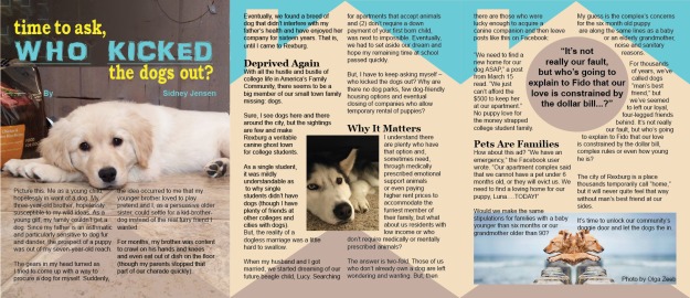
Below is the final outcome of my project. The article, “Time to Ask, Who Kicked the Dogs Out,”  was written by Sidney Jensen and it is about the less than friendly behavior of housing in Rexburg when it comes to animals. My objective was to design an effective layout to properly portray the love of dogs and appeal to those who can implement change. Our love of dogs surpasses understanding and has existed as far back as we can trace. This issue needs to be brought to light and discussed. There is a sharp contrast between sad puppy pictures and then a happy dog at the conclusion of the article. The manuscript of this article can be found at http://byuiscroll.org/time-to-ask-who-kicked-the-dogs-out/ by the original author.

who kicked the dogs out

Audience Analysis:

My intended audience is anyone who can persuade others to look out for pet owners. Luckily the federal government has already implemented emotional support animal laws to protect people who need animals to increase the quality of life by suppressing any form of mental illness or instability. Of course, the background outline is in the shape of a house with a chimney; this helps to look like a housing brochure. That way, I can reach out and gain the attention of landlords or apartment owners. This article appeals to their emotions and helps them see the benefits of being merciful. A lot of people can identify with this article while living in Rexburg, Idaho.  The bright design and sad puppy pictures helps to portray a bright future for the sad circumstances that exist.

Design Analysis

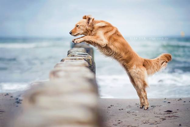
The first picture on page one looked best zoomed in and in the center of the page. The close-up shows the sadness in the eyes of both dogs that have pictures in the center of the page. As mentioned above, the background of pages two and three is an outline of a house with a chimney. This helps to make the connection between real estate and dog owners. The last picture was taken off of a website listed at the conclusion of this post and the blue helps to go with the blue in the sky section of page three. The gray helps draw attention through leading lines to the husky, and emphasizes the quote in the circle. Proximity is used surrounding the quote and picture with text wrap. A sad husky picture is also placed by a section titled, “Why it matters.” Alignment is used brilliantly in the title. The left alignment on top of the title stops where the right alignment on the bottom picks up. Each side lines up with the overall alignment. Repetition is used with the triangles on the bottom of each page. Contrasting fonts and colors are used there as well. The second and third page use a matching house outline. The title emphasizes the suggestive persecution or violence towards animals that are innocent and loving.

Project Color:

The background picture on the first page was a tough one to match color with. There is a small house shape with a dark gray color that was matched with a light blue and yellow for the darker parts because it looks good with that blue. Blue persists throughout the next two pages by representing the blue sky. It concludes by matching up with more blue in the picture taken from a beach. The dark gray inside the circle matches up with the background of the first picture and some parts of the flooring. It helps the quote to stand out and resembles a road leading to the picture of the husky. This is using the photography technique “leading lines.” Using the black text helped to stand out on the lighter color tile and backgrounds that matched.

Font:

The yellow font is a serif font called Bookman Old Style. It is old style because of the slight transition between thin and thick. This contrasts with the blue between that uses a font called AR DARLING. The blue is a sans serif font without any serifs hanging off of the letters. The blue on the first page is exaggerated and slightly decorative to draw attention to what the title is saying. It almost reminds me of a school yard with lots of energy and chalk writing. There is also contrast in the title between lowercase and uppercase words. My section headings use a font called Georgia, which is a serif font style. The normal  text used for the article is Arial to contrast with the headings. It is a sans serif font. Using bold text with italics helps to draw attention to the quote.

Conclusion:

In conclusion, this project utilizes many tools in InDesign. There is a quote in a circle that is text wrapped and a rectangle picture as well. The color scheme was chosen based on what went well with the picture colors on page one. Other colors that were used were matched by Photoshop to the carpet and background.  The quote appeals to human emotion and the quote itself is positioned in the heart of the home in the background. This is where dogs belong; they belong by our side and in our hearts. We need our love for them to be unrestrained to help us learn to love. I hope this advertisement captures some of that hope.


Pictures Used:

Leading Lines

Linked to a website for credit to the photographer, Olga Zeeb

Photo taken by me, Bryce Shearer

Photo by me, Bryce Shearer


Journalism and News

5/11/17

Today in class we learned about journalism and news media from Lane Williams. We were strongly encouraged to start writing about things we are passionate about. Our careers started when we  graduated high school and we need to have something to show to future employers. Anything can happen while internet media is incredibly popular. We were also encouraged to subscribe to the Wall Street Journal and consider news journalism as our emphasis.

Graduation Plans 5/4/17

Graduation planning is a beneficial process for BYU-Idaho and myself. Planning what courses to take next helps me compartmentalize everything that needs done. We learned about graduation plans in communications class on Thursday evening; the date was May 4th. This process will tell the school how many classes are needed and tells us what still needs done. Without a proper vision, it is hard to reach our goals. The presenter was Sheila Wener.